18 Microeconomics graphs you need to know for the Exam
Updated 3/21/2024 Jacob Reed Below you will find a quick review of all the graphs that are likely to show up on the Advanced Placement Microeconomics exam.
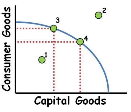
•1.Inefficient use of resources, but it is possible to produce at this point. •2.Scarcity prevents this level of production without new resources. (trade may also make this point possible). •3 to 4 Increasing opportunity costs if PPC is concave. This is due to resources not being equally adaptable to both products. For constant costs the PPC will be a straight line. •Increases in the quality or quantity of resources as well as technological improvements will shift the PPC outward. •Decreases in the quality or quantity of resources will shift the PPC inward.
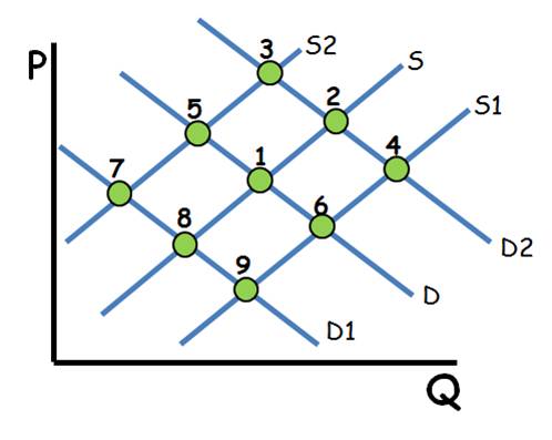
Single Shifts •Demand ↑=P ↑ Q ↑: Point 1 to 2 •Demand ↓=P ↓ Q ↓: Point 1 to 8 •Supply ↑= P↓ Q↑: Point 1 to 6 •Supply ↓= P ↑ Q↓:Point 1 to 5 Double Shifts •When 1 axis shows an increase then decrease with each shift, that axis is indeterminate. •Demand ↓ Supply ↓ P Indeterminate Q ↓:Point 1 to 8 to 7. •Demand ↑ Supply ↑ P Indeterminate Q ↑: Point 1 to 2 to 4. •Demand ↑ Supply ↓ P ↑ Q Indeterminate: Point 1 to 2 to 3. •Demand ↓ Supply ↑ P ↓ Q Indeterminate: Point 1 to 8 to 9
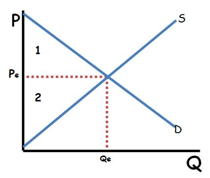
•Consumer surplus is the difference between what consumers are willing to pay (the demand curve) and the price they actually pay. It is found by taking the price consumers pay from the y axis straight across to the demand curve or the quantity exchanged (whichever is less), then going up until you hit the demand curve. •Producer surplus is the difference between the marginal cost of production and the price. It is found by taking the price producers receive from the y axis straight across to the supply curve or the quantity exchanged (whichever is less), then going down until you hit the supply curve. 1.Consumer Surplus 2.Producer Surplus 1+2= Economic Surplus
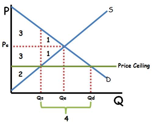
1.Triangle is deadweight loss 2.Producer surplus 3.Consumer Surplus 4.There is a surplus of products in the market (Qs>Qd) •The quantity that actually exchanges hands is Qd (there can be more sold than consumers are willing to buy at the current price.
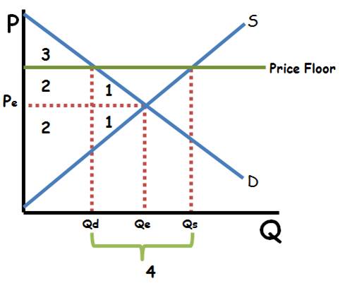
1.Triangle 1 is deadweight loss 2.Producer surplus 3.Consumer Surplus 4.There is a Shortage of products in the market (Qs<Qd) •The quantity that actually exchanges hands is Qs (there can be more sold than producers are willing to sell at the current price.
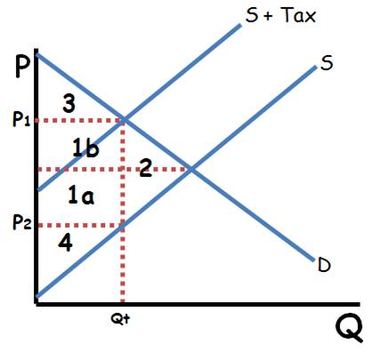
1.Total Tax Revenue (1a + 1b) 1a Producer tax burden 1b consumer tax burden 2.Deadweight loss 3.Consumer Surplus 4.Producer Surplus •Qt= Quantity produced and demanded •Price of tax = P1-P2 •P1=Price consumers pay •P2=Price producers receive **This is a per-unit excise tax **This tax reduces efficiency and creates deadweight loss. **Tax revenue is part of economic surplus along with consumer and producer surplus.
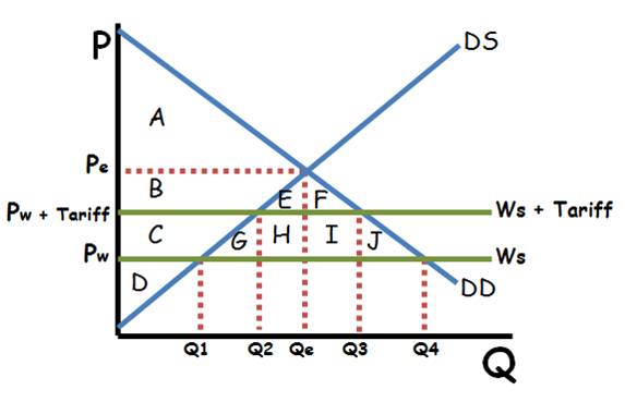
No trade: •Pe and Qe equilibrium •Consumer surplus A •Producer surplus BCD No Tariff: •Pw is the price •Q1 domestically produced. •Q4 is consumed •Q4-Q1 is imported •Consumer surplus ABCEFGHIJ •Producer Surplus D With Tariff: •Pw+Tariff is the price •Q2 domestically produced •Q3 domestically consumed •Q3-Q2 is imported •Consumer Surplus ABEF •Producer Surplus CD •Tax Revenue HI •Deadweight loss GJ
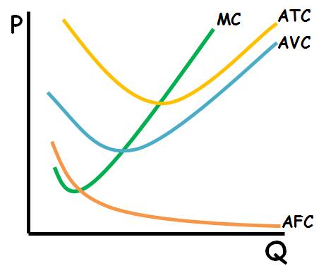
•AFC – Represents all the costs the business must pay to operate even if they produce zero output. Also called sunk costs. i.e. rent, insurance, loan payments, lump sum tax etc. A change in Fixed costs only shifts the AFC and ATC (up or down) •AVC – Represents the costs associated with producing more or less output. i.e. labor, raw materials, per unit tax, etc. A change in variable costs shifts the AVC, ATC, and MC (up or down) •ATC = AVC + AFC •MC = The costs associated with producing one more unit of output (impacted by variable costs)
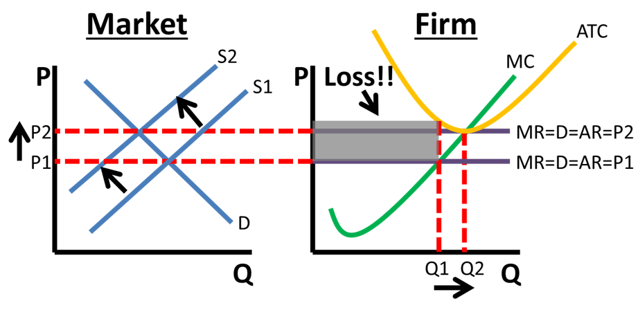
The economic loss causes firms to exit the industry, shifting the supply curve left, raising the price (MRDARP) until the firm breaks even. **Allocatively Efficient in the long-run and the short-run (Price=MC)
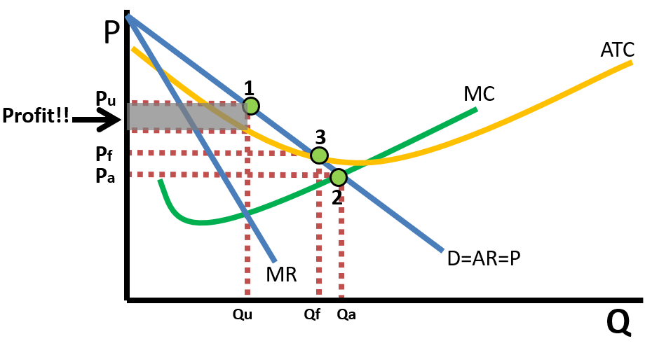
The economic profit causes firms to enter the industry, shifting the supply curve right, lowering the price until the firm breaks even. **Productively efficient in the long run (produces at the minimum of the ATC).
1.The monopoly price and quantity Pu and Qu when if it is unregulated. 2.The allocatively efficient price and quantity. A government price ceiling here would cause the firm to incur a loss. 3. Fair return price. A price ceiling here would still be inefficient, but there would be less deadweight loss and the firm would break even so it would continue to operate in the long run. 4.If this is a monopolistically competitive market, firms would enter the market shifting MR and DARP left as this firms market share decreases. **Monopolies have excess capacity and are not productively efficient (do not produce at the minimum of the ATC) **Monopolies are not allocatively efficient (Price>MC) when they are unregulated. **If a monopoly perfectly price discriminates, the MR merges with the DARP and they become allocatively efficient.
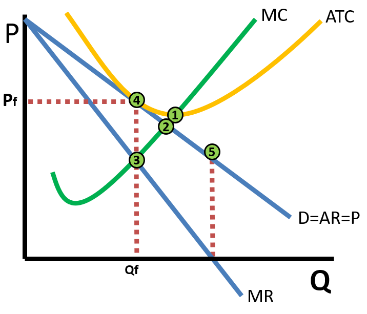
1.Productive efficient point (Minimum of ATC) 2.Allocative efficient point (MC=P) quantity below 3.Actual output (MR=MC) and price (DARP above MR=MC at point 4) 5.Unit elastic portion of the demand curve (where MR equals zero at that quantity). Demand is inelastic below and elastic above this point. •Deadweight loss is in the triangle between points 2,3, & 4. •If the firm is making a profit (the ATC is lower than price), firms will enter the market giving each existing firm a smaller share of the market. That shifts DARP and MR to the left. •If the firm is incurring a loss (ATC higher than price), the opposite occurs as firms exit the market.
•Industry – When the supply of labor in the industry decreases (shifting supply to S2) the wage increases and the quantity of workers decreases •Firm – The increase in the wage shifts the firm’s labor supply curve (MRC) upward. As a result, they hire fewer workers (Q2)
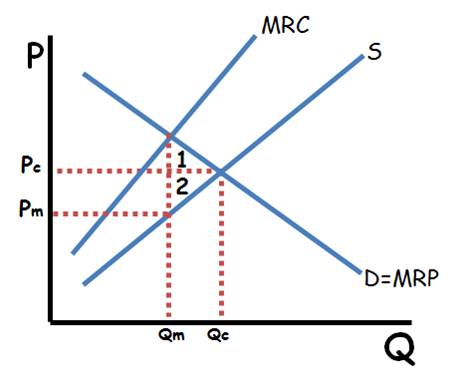
•Firm still hires the quantity where MRC=MRP •Pm is the wage all workers are paid and Qm is the number the firm hires. •Pc and Qc is the wage and number of workers hired if this were a competitive market. A monopsony hires fewer worker and pays lower wages than a competitive market. •The MRC is higher than the wage (supply) because the firm must raise the wage for all of their workers when they hire more. •1 and 2 are deadweight loss.
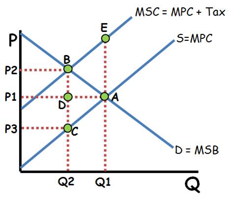
A.The output and price without government intervention. Inefficient because the MSC>MSB due to the externality ABE = Deadweight loss before the tax (no deadweight loss after the tax) created by over production B.The output and price after the tax. (The tax shifts the supply curve to the left) CBP2P3=Total Tax Revenue P2-P3=The price of the tax CDP1P3=Tax paid by producer BDP1P2= Tax paid by consumer **Here the tax makes the market more efficient and reduces deadweight loss.
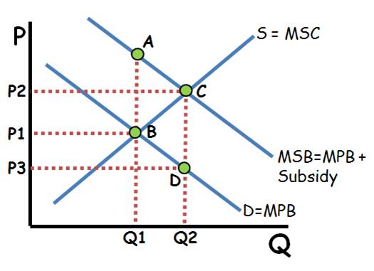
B. The output and price without government intervention (inefficient because MSB>MSC) C. The efficient output and price where MSC=MSB ABC=the deadweight loss created by under production prior to the subsidy. There is no deadweight loss after the subsidy corrects this market failure. P2-P3=The value of the subsidy. P2P3DC= The total Cost of the Subsidy **Here a tax would increase deadweight loss.
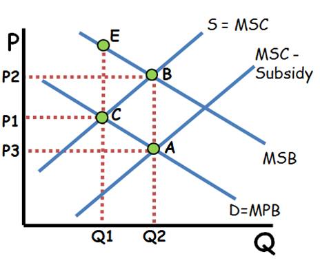
C. Output and price without government intervention. Inefficient because MSB>MPC. BCE=Deadweight loss created by underproduction. There is no deadweight loss after the subsidy Since the subsidy is given to the producer instead, it shifts the supply curve to the right (MPC-Subsidy) Q2. The efficient quantity where MSB equals MSC (No external cost so MSC is MPC). P2 is the price suppliers receive after the subsidy. P3 is the price consumers pay after the subsidy. P2-P3=The value of the subsidy P2P3AB=The Total Cost of the subsidy **Here a tax would increase deadweight loss.
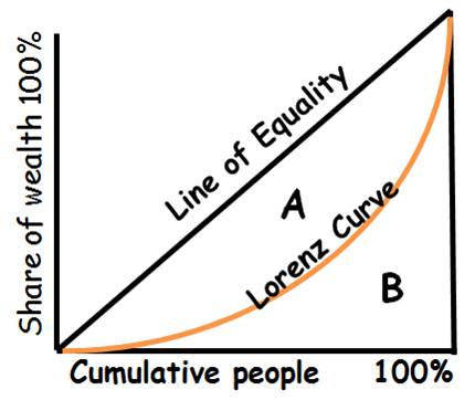
•Lorenz curve – measures the distribution of wealth within a country. •The closer the curve is to the line of equality, the more equal the distribution is. •Gini Ratio = A/(A+B) –Value of zero – Complete equality –Value of one – Complete inequality